

In case 2026 Heo 10039, decided on 3 September 2026, Korea’s Patent Court examined whether features that fasten a component can also be visually important. The overall form and arrangement of the fastening elements outweighed differences in their proportions and spacing.
A scope dispute over a conduit-connector fastener
Registered design No. 1176358, filed on 31 May 2022 and registered on 2 August 2022, concerned a metal fastener for a conduit connector. It is fitted inside the connector between an electrical wiring box and a conduit to hold the conduit in place.
The owner sought an affirmative scope determination against the defendant: a declaration that the specifically identified comparison design fell within the registered design’s protection. Both designs concerned the same type of article.
On 30 December 2025, the Intellectual Property Trial and Appeal Board rejected that request in case 2025 Dang 1905, finding different overall aesthetic impressions. The owner challenged that decision before the Patent Court.
An open cylinder and four diagonal fastening elements
Both designs had an overall cylindrical form with one side cut open. Four fastening elements were arranged diagonally around the sides, comprising two upper and two lower elements.
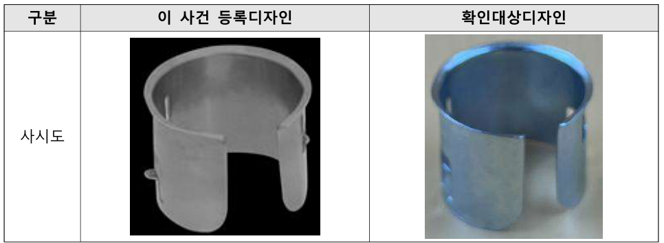
The upper elements extended downward, with a bent plate and an inwardly bent tab forming a “u”-shaped opening. The lower elements extended upward, with a bent plate and an outwardly bent tab forming an “n”-shaped opening.
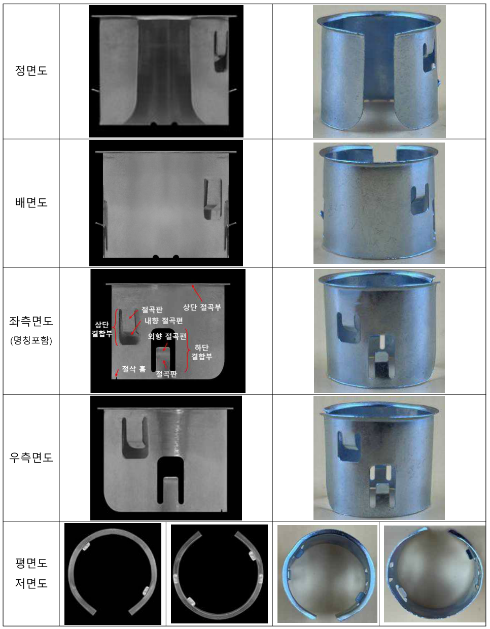
Both also had an outwardly bent upper rim and curved lower corners at the open side. The court identified the overall form, fastening-element shapes and arrangement, and upper rim as features most likely to attract the viewer’s attention and shape the overall impression.
Function did not remove the fastening elements’ visual importance
The lower outward tabs engaged holes in the connector; the upper inward tabs held the conduit inserted into the fastener. These parts therefore had a real mechanical function.
Where alternative shapes can provide the same function, a shape is not necessarily the only indispensable one. Unless special circumstances such as a known commonplace shape apply, functionality alone does not require its importance in a similarity assessment to be discounted.
Earlier designs showed that the same function could be achieved with different shapes, positions and numbers of fastening elements. The shared diagonal arrangement of four elements, with upper “u” and lower “n” openings, was not found in those other designs. It remained significant to the overall visual impression.
The court acknowledged differences in proportions and spacing
The upper rectangular openings had width-to-height proportions of approximately 1:2 in the registration and 1:1 in the comparison design. The ratio between the bent plate and the outward tab was approximately 2:1 and 1:1 respectively.
Viewed from the side, the registered design had a smaller gap between the upper rim and upper fastening elements. Its upper and lower elements partly overlapped, while those in the comparison design were slightly separated.
The court treated these as fine differences visible on close inspection or ordinary commercial or functional variations, without a substantial effect on the overall impression. This was a contextual assessment of their weight, not a rule that small differences can always be disregarded.
Lower cut-outs and the defendant’s comparison material
Two semicircular cut-outs appeared at the bottom of the registered design but not in the comparison design. They too were considered minor details. Similar cut-outs appeared in some known designs and seemed incidental to manufacturing; their absence did not change the overall impression.
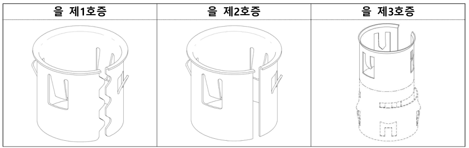
The defendant relied on three other registered designs to argue that detailed fastening-element shapes were dominant features. But those examples differed in the number and arrangement of elements and in the actual forms of the inward and outward tabs.
Those differences in form were not equivalent to the limited differences in proportions and spacing between the two designs in dispute. The court considered what each comparison actually demonstrated.
Similarity led to annulment of the Board’s decision
Designs are compared as wholes, rather than simply by separating and counting individual elements. The question is whether ordinary consumers receive similar aesthetic impressions, taking account of the visually dominant features.
Here the open cylindrical form, four diagonal fastening elements with their “u” and “n” shapes, and upper rim were shared. The detailed differences did not change the overall impression, so the comparison design fell within the registered design’s scope.
The court granted the owner’s claim and annulled the decision of 30 December 2025 in case 2025 Dang 1905. This was a determination of design scope, not a civil judgment awarding damages or ordering an injunction.
Assessing alternatives when changing a functional component
When reviewing a component design, consider whether other shapes can perform the same function. If they can, a shared shape and arrangement may remain visually important despite their mechanical role.
A design-change explanation should go beyond dimensions and gaps. It should connect the overall form, the number and placement of eye-catching features, and the relative significance of the differences to the resulting impression.
This judgment illustrates why function and appearance need to be considered together. A functional component can take many forms, and small proportional changes may leave its dominant visual features substantially similar.
The original figure labels and forms are preserved; the text explains the source material.